Telling A Story With Data
 In the Introduction of Cole Nussbaumer Knaflic's 2015 book, Storytelling With Data, the first sub-heading sets the tone for her magnificent drill-down into the details of what it takes to actually do something useful with data: "Bad Graphs are Everywhere." From here, Ms. Knaflic takes us through several unique primers on the ascetics and design considerations of presenting data in a way that can impart meaning.
Isn't this why we gathered and analyzed this data in the first place? Clearly, we were looking for the meaning behind the data and felt that -- once we got there -- the data would tell us a story. Now the challenge is to further develop and articulate this story so that it can be shared with others. But what do we usually do next? We develop graphs in Microsoft Excel that cannot really be read but must be deciphered like hieroglyphics. For example, the graph that Ms. Knaflic calls the Spaghetti Graph:
Why do we do this to ourselves? As Ms. Knaflic explains:
In school, we learn a lot about language and math. On the language side, we learn how to put words together into sentences and into stories. With math, we learn to make sense of numbers. But it's rare that these two sides are paired: no one teaches us how to tell stories with numbers.
A Lesson in Data Narratives From the Data Wizards
So what is the secret to telling a story with data and truly communicating the information that it provides? Are there some examples we can look to?
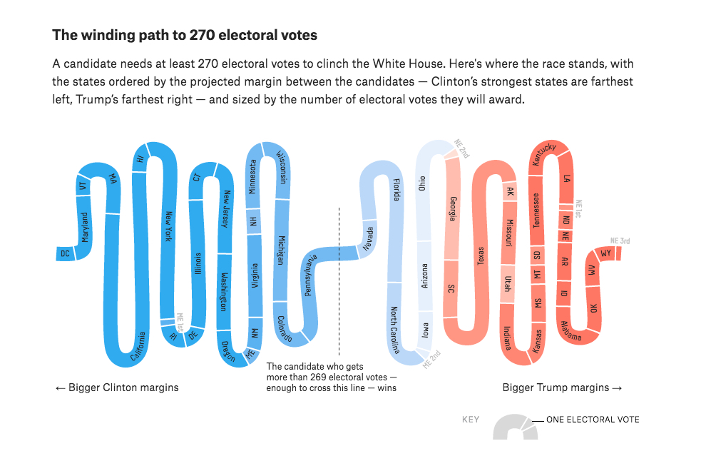
In terms of good examples of telling a story with data, I don't think you need to look much further than FiveThirtyEight's website that provides some stunning examples of the right way to tell a story with data, like the Electoral College graphic shown above. Behind this graphic is a significant amount of statistical modeling and simulation of the resultant model of the 2016 Presidential Election 10,000 times for each model run. All of this complexity, however, is less important for the broader audience that simply needs to know what all of this means to the Presidential election.
Ms. Knaflic breaks the process of telling a story with data into six components:
1. Understand the context
2. Choose an appropriate visual display
3. Eliminate clutter
4. Focus attention where you want it
5. Think like a designer
6. Tell a story
In the "Final Thoughts" section of Storytelling With Data, we are reminded that "when most people think about data, one of the furtherest things from their mind is creativity. But within data visualization, there is absolutely space for creativity to play a role. Data can be breathtakingly beautiful."